It has long been known that Greenland and Antarctica have lost and are continuing to lose ice at a catastrophic rate.
But the ice losses are so big and the terms so unfamiliar that it can be hard to visualize what this looks like. In an effort to help translate the metrics NASA has created a series of animations.
According to the US space agency, satellite data shows that Greenland and Antarctica are losing mass at a rate of 283 gigatons and 145 gigatons per year, respectively.
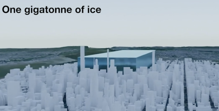
But most of us have little idea what a gigaton is, let alone what it looks like. It is one billion metric tons, or equivalent to 10,000 fully loaded US aircraft carriers, says the agency.
Another way to see visualize it is as a block of ice stretching the length and breadth of New York’s Central Park (which is 4km long and 0.8km wide) and rising up 341m.
Another of the animations visualizes ice loss at the two poles over a 15-year period as documented by NASA. According to the agency, between 2002 and 2017, 5,641 gigatons of ice of were lost in Greenland and Antarctica. This is enough to cover Texas in a sheet of ice 8m thick.
Meanwhile since the start of the 20th century an estimated 49,000 gigatons of ice have disappeared from both poles. This is enough ice to cover the entire the land mass of the US in an ice sheet 7m thick, or to coat the whole of the Moon in a 1.5m-thick ice sheet.
To see all the animations, click here.


